Collaborative Excel: Harnessing the Power of Collaboration Features

Real-Time Co-Authoring

Section 1: Enabling Real-Time Co-Authoring
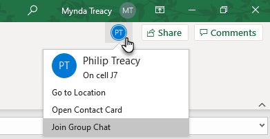
- *How to set up co-authoring in Excel:* To enable co-authoring, you can use OneDrive, SharePoint, or Microsoft 365. For instance, if you have an Excel workbook stored in OneDrive, you can open it in Excel Online and share it with your collaborators. Here's how:
    1. Upload your Excel file to OneDrive.
    2. Open the file in Excel Online.
    3. Click the "Share" button and invite collaborators via email.

Interactive Example:
- Let's imagine you and a colleague, Sarah, are collaborating on a budget spreadsheet. You upload the file to OneDrive, open it in Excel Online, and share it with Sarah. You both can edit the spreadsheet simultaneously.

Section 2: Co-Authoring in Action
- Real-time editing and updates: When both you and Sarah are editing the budget spreadsheet, any changes made by one person are immediately visible to the other. For instance, if Sarah updates the monthly expenses, you'll see her changes in real-time, and vice versa.

- Chat and commenting features: While working on the budget spreadsheet, you can use the chat or comment feature to discuss specific cells or sections. For example, if you have a question about a particular expense, you can leave a comment on that cell, and Sarah can respond to it.

Interactive Example:
- You and Sarah are discussing a budget item in the chat while making changes to the spreadsheet. You add a comment to a cell, asking Sarah for clarification. She responds to your comment, providing the information you needed.

Sharing and Permissions

Section 1: Sharing Workbooks
- How to share an Excel workbook with others: You can share a workbook by:
    1. Clicking the "Share" button in Excel Online.
    2. Entering the email addresses of your collaborators.
    3. Choosing their permission level (edit or view).
    4. Sending the invitations.
Interactive Example:
- You share the budget spreadsheet with Sarah by entering her email address and granting her edit permissions. She receives an email invitation and can access the workbook when she accepts it.

Section 2: Managing Permissions
- Setting view, edit, and ownership permissions: In Excel Online, you can manage permissions. For instance, you can give Sarah view-only access to a specific worksheet while allowing her to edit another. You can also revoke her access at any time.

Section 3: Tracking Changes
- Monitoring changes made by collaborators: Excel tracks changes made by all collaborators. You can access the "Review" tab to see who made specific changes and when. You can accept or reject these changes as needed.
Interactive Example:
- Sarah edits a formula in the budget spreadsheet. You review the changes in the "Review" tab, see her modifications, and decide to accept them.

Comments and Notes

Section 1: Adding Comments
- Inserting comments to specific cells: Comments are helpful for discussing specific parts of a workbook. For instance, you can right-click on a cell, choose "New Comment," and add a comment like "Please verify this figure."

Section 2: Adding Notes
- Attaching general notes to worksheets or workbooks: Notes provide context to the entire worksheet or workbook. You can go to the "Review" tab, click "New Note," and add a note with details about the budget process.

Interactive Example:
- You add a comment to a cell in the budget spreadsheet, asking Sarah to double-check a calculation. You also attach a note to the worksheet, explaining the overall budgeting strategy.


Version History and Restoring Previous Versions

Section 1: Accessing Version History
- Viewing and navigating version history: Excel keeps a record of changes made over time. You can access this history by clicking on "File," then "Info," and selecting "Version History." This allows you to see previous versions of the workbook.

Section 2: Restoring Previous Versions
- Restoring a workbook to a previous version: In the version history, you can select a previous version and choose to restore it. This is handy if you want to revert to an earlier state of the workbook.

Interactive Example:
- You and Sarah have been making changes to the budget spreadsheet over a week. You realize that some recent changes have caused errors. You access the version history, select a version from a few days ago when the spreadsheet was correct, and restore it to that state.


Conclusion:
Collaborative features in Excel enhance teamwork and streamline the process of working on spreadsheets with others. Whether it's real-time co-authoring, managing permissions, adding comments, or tracking versions, Excel's collaborative tools simplify collaboration and improve productivity, making it easier than ever to work together on data-driven projects.

Mastering Time: Working with Date and Time Data in Excel

Introduction

Microsoft Excel is a versatile tool for data analysis, and one of its strengths lies in its ability to handle date and time data effortlessly. Whether you're tracking project milestones, analyzing sales trends, or managing schedules, Excel offers a wide array of features to help you work with date and time data effectively. In this blog, we will explore the essentials of working with date and time data in Excel.

Part 1: Date and Time Basics

Understanding Excel's Date and Time Format

Excel stores date and time values as numbers, with each day represented by a whole number and time as a decimal fraction. Here's how it works:

- Dates are stored as whole numbers, where January 1, 1900, is represented as 1, January 2, 1900, as 2, and so on.
- Times are stored as decimal fractions of a day, where 0.5 represents 12:00 PM (noon), and 0.25 represents 6:00 AM.

Entering Date and Time

You can enter date and time data manually or use Excel's built-in date and time functions. To enter date and time manually, simply type the date or time in an Excel cell using a recognized format (e.g., "mm/dd/yyyy" or "hh:mm AM/PM").

Part 2: Date and Time Functions

Excel offers a variety of functions to manipulate and analyze date and time data:

Date Functions

- TODAY(): Returns the current date.
- DATE(): Constructs a date from year, month, and day values.
- DAYS360(): Calculates the number of days between two dates using the 360-day calendar.

Time Functions

- NOW(): Returns the current date and time.
- TIME(): Constructs a time value from hours, minutes, and seconds.
- HOUR(), MINUTE(), SECOND(): Extract individual time components.

Date and Time Calculations

- DATEDIF(): Calculates the difference between two dates in various units (days, months, years).
- NETWORKDAYS(): Calculates the number of working days between two dates, excluding weekends and specified holidays.

The TEXT Function

The TEXT function in Excel is a versatile tool that allows you to format date and time values exactly as you need them. It's particularly useful when you want to display dates and times in a specific format that isn't covered by Excel's default date and time formats.Syntax:=TEXT(value, format_text)value: The date or time value you want to format.format_text: A text string specifying the format you want to apply to the value.Example:
 =TEXT(A1, "dddd, mmm d, yyyy") this will return        Monday September 2 202

Date Concatenation

Date concatenation involves combining two or more date values or date components into a single cell. This can be useful for creating custom date labels or constructing date ranges.Example: To concatenate the day, month, and year from separate cells, you can use a formula like this: =TEXT(A1, "dd") & "/" & TEXT(A1, "mm") & "/" & TEXT(A1, "yyyy")
Part 3: Formatting and Customization

Excel provides extensive options for formatting and customizing date and time data:

- Date and Time Formatting: You can apply various date and time formats to cells to display values as per your preference.
- Custom Formats: Create custom date and time formats to display data exactly how you want it.
- Data Validation: Use data validation rules to ensure that date and time entries meet specific criteria.
Part 4: Date and Time Data Analysis

Sorting and Filtering

Sort and filter your data by date or time to identify trends, patterns, or specific date-related information.

Pivot Tables

Leverage Pivot Tables to summarize and analyze date and time data. Grouping by date intervals (e.g., months, quarters) can reveal insights quickly.

Charts and Graphs

Create visually appealing charts and graphs to represent your date and time data, making it easier to convey information to others.

Conclusion

Excel's robust features for working with date and time data make it an invaluable tool for professionals across various industries. Whether you're managing schedules, analyzing historical trends, or tracking project timelines, mastering these techniques will help you make informed decisions and gain deeper insights from your data. So, embrace the power of Excel in handling date and time data, and watch your productivity soar.

Unleash the Power of Text Splitting in Excel

Introduction:
Working with text data in Excel often requires breaking down or splitting text into multiple columns. Whether you're dealing with names, addresses, or other textual information, Excel offers several powerful techniques for text splitting. In this guide, we'll explore various methods to make your text data more manageable.

Chapter 1: Text to Columns Wizard

Introduction:
The Text to Columns feature is Excel's built-in tool for splitting text based on specific delimiters.

Section 1: Splitting Text by Delimiter
- How to use the Text to Columns Wizard.
- Splitting text based on comma, space, or custom delimiters.

Section 2: Handling Date and Time Data
- Splitting date and time into separate columns.
- Formatting date and time correctly after splitting.

Section 3: Advanced Options
- Using multiple delimiters for complex text splitting.
- Handling consecutive delimiters.

Interactive Example:
Split a column of full names into separate first and last name columns using the Text to Columns feature.


Chapter 2: Using LEFT, RIGHT, and MID Functions

Introduction:
Excel functions like LEFT, RIGHT, and MID provide fine-grained control for text manipulation.

Section 1: Extracting Text from the Left
- How to use the LEFT function.
- Extracting a specific number of characters from the beginning of a text string.

Section 2: Extracting Text from the Right
- How to use the RIGHT function.
- Extracting characters from the end of a text string.

Section 3: Extracting Text from the Middle
- How to use the MID function.
- Extracting characters from anywhere within a text string.

Interactive Example:
Use the LEFT function to extract the first few words from a column of product descriptions.


Chapter 3: Splitting Text with Flash Fill

Introduction:
Flash Fill is a time-saving tool that can automatically detect and split text based on patterns.

Section 1: Basic Text Splitting with Flash Fill
- How to enable and use Flash Fill.
- Splitting text based on simple patterns.

Section 2: Advanced Splitting with Flash Fill
- Splitting text with irregular patterns.
- Combining Flash Fill with other text manipulation techniques.

Interactive Example:
Split a column of email addresses into separate username and domain columns using Flash Fill.


Chapter 4: Power Query for Complex Text Splitting

Introduction:
Power Query is a powerful tool for handling complex text splitting tasks and transforming data.

Section 1: Introduction to Power Query
- What is Power Query, and why use it for text splitting?
- Loading data into Power Query.

Section 2: Splitting Text with Power Query
- Using the Split Column feature.
- Handling text splitting with advanced transformations.

Section 3: Combining Multiple Steps
- Creating a series of transformations for comprehensive text splitting.
- Managing query steps.

Interactive Example:
Split a column of addresses into separate street, city, state, and ZIP code columns using Power Query.


Conclusion:
Excel provides a versatile toolkit for text splitting, allowing you to break down text data in various ways to suit your needs. Whether you're dealing with names, addresses, or other textual information, mastering these techniques will make your data more organized and accessible, saving you time and effort in data manipulation tasks.

Mastering Excel Pivot Tables and Charts: Your Comprehensive Guide

Introduction

Microsoft Excel is a powerful tool for data analysis and visualization. Among its many features, Pivot Tables and Charts stand out as essential tools for anyone looking to analyze and present data effectively. In this blog, we'll dive deep into these two features, exploring how to create, customize, and leverage them to gain valuable insights from your data.

Part 1: Pivot Tables

What is a Pivot Table?

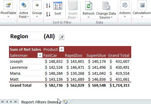
A Pivot Table is a data processing tool that allows you to summarize, analyze, and rearrange data from a spreadsheet or database. It's particularly useful for handling large datasets with numerous variables. Here's how to create a Pivot Table:

1. Select Your Data: Begin by selecting the data range you want to analyze.

2. Insert Pivot Table: Go to the "Insert" tab and select "Pivot Table."

3. Choose Rows and Values: Drag and drop fields into the Rows and Values areas. You can apply various calculations (e.g., sum, average) to the values.

4. Customize Your Pivot Table: Format, filter, and sort your Pivot Table to fit your needs.

Benefits of Pivot Tables

- Simplify Data Analysis: Pivot Tables provide a clear and concise way to summarize and explore data, making it easier to identify trends and patterns.

- Dynamic Updates: When your source data changes, Pivot Tables can be updated with a simple click, ensuring your analysis remains current.

- Customization: You have full control over the layout and calculations within your Pivot Table, tailoring it to your specific requirements.

Part 2: Pivot Charts
What is a pivot Chart? 

Pivot Charts complement Pivot Tables by offering visual representations of the summarized data. They allow for a quick, intuitive understanding of complex datasets. To create a Pivot Chart:

1. Create a Pivot Table: Before generating a Pivot Chart, you need to create a Pivot Table.

2. Insert Pivot Chart: With the Pivot Table selected, go to the "Insert" tab and choose the chart type that suits your data.

3. Customize Your Pivot Chart: Like regular Excel charts, you can customize colors, labels, and other chart elements.

Benefits of Pivot Charts

- Data Visualization: Pivot Charts transform data into visually appealing graphs, making it easier to communicate findings to others.

- Interactivity: You can interact with Pivot Charts linked to Pivot Tables, enabling you to explore data in real-time.

Part 3: Advanced Tips

1. Slicers

Slicers are visual filters that allow users to interactively filter Pivot Tables and Charts. They enhance the user experience and enable quick data exploration.

2. Grouping Data

You can group data in Pivot Tables by dates, numbers, or custom categories, simplifying the analysis of large datasets.

4. Pivot Charts Styles

Experiment with different chart styles to find the one that best conveys your data's message.

Certainly! Measures and Calculated Columns are powerful tools in Excel that can enhance your data analysis capabilities. Let's briefly explore how they can be used alongside Pivot Tables and Charts:

Part 4: Measures and Calculated Columns

Measures

Measures are dynamic calculations applied to data within a Pivot Table. They allow you to perform calculations on the fly without altering your source data. Here's how to use measures:

1. Create a Pivot Table: Start by creating a Pivot Table as usual.

2. Insert Measure**: Right-click on your Pivot Table and select "Add Measure" or "New Measure" (depending on your Excel version).

3. Define the Calculation: Write a formula for your measure. For example, you can calculate the total sales, average profit margin, or growth rate.

4. Use Measures in Pivot Tables: Once defined, measures can be used as values within your Pivot Table, enabling you to perform calculations without altering the underlying data.

Calculated Columns

Calculated Columns, on the other hand, allow you to add new columns to your dataset based on custom calculations. Here's how to use calculated columns:

1. Select Your Data: Start by selecting the data range where you want to add a calculated column.

2. Insert Calculated Column: Go to the "Data" tab, click "Get & Transform Data" (Power Query), and select "Add Column" > "Custom Column."

3. Define the Calculation: In the formula bar, write the formula for your calculated column. This can involve combining existing columns, performing mathematical operations, or applying conditional logic.

4. Apply the Calculated Column: The calculated column is now part of your dataset and can be used in Pivot Tables, Charts, or any other data analysis tasks.

Benefits of Measures and Calculated Columns

- Flexibility: Measures and Calculated Columns provide flexibility in data analysis by allowing you to perform custom calculations to derive meaningful insights.

- Reusability: Once created, measures and calculated columns can be reused across different Pivot Tables and Charts, saving time and effort.

- Enhanced Insights: These features enable you to perform complex calculations, aggregations, and transformations, opening up new avenues for data analysis.

Incorporating measures and calculated columns into your Excel data analysis toolkit alongside Pivot Tables and Charts can greatly expand your ability to uncover valuable insights and make more informed decisions based on your data. Experiment with these tools to discover their full potential in your data analysis workflow.

Conclusion
Excel's Pivot Tables and Charts are indispensable tools for anyone working with data. They empower users to analyze, summarize, and visualize data efficiently. By mastering these features and their advanced capabilities, you can transform raw data into valuable insights that drive informed decision-making. So, start exploring and harnessing the power of Pivot Tables and Charts in Excel today!

Navigating the Excel Interface: A Beginner's Guide


Introduction:
Microsoft Excel is a powerful spreadsheet software used for various tasks, from simple data entry to complex data analysis. To harness its capabilities effectively, it's crucial to understand the Excel interface and navigation. In this guide, we'll walk you through the key elements of the Excel interface and how to navigate them.

The Excel Interface:

1. Workbook:
   - Excel documents are called workbooks.
   - Each workbook can contain multiple worksheets.
   - By default, a new workbook opens with three blank worksheets labeled Sheet1, Sheet2, and Sheet3.
2. Ribbon:
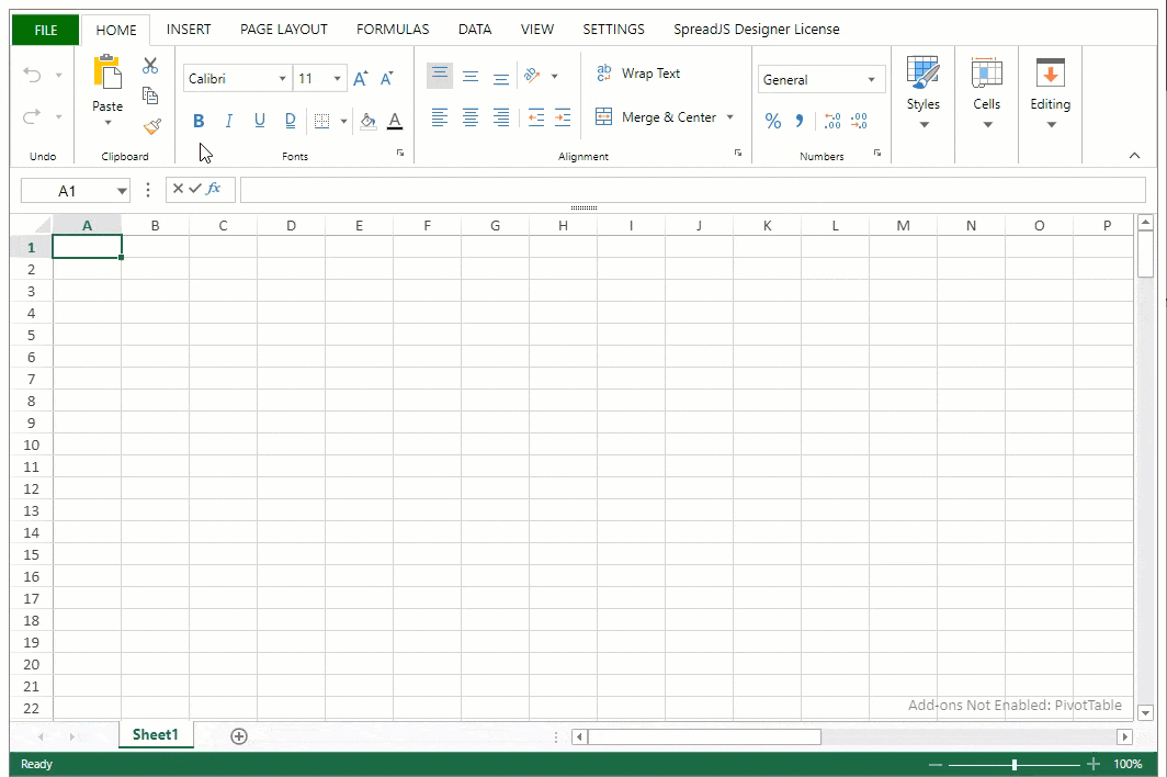
   - The Ribbon is the horizontal toolbar at the top of the Excel window.
   - It contains tabs like Home, Insert, Page Layout, Formulas, Data, Review, and View.
   - Each tab has groups of related commands and functions.
3. Quick Access Toolbar:
   - Located above the Ribbon, it provides easy access to commonly used commands.
   - You can customize it to add your favorite commands.
4. Formula Bar:
   - Just below the Ribbon, the Formula Bar displays the contents of the active cell.
   - You can use it to enter or edit data and formulas.
5. Name Box:
   - The Name Box, to the left of the Formula Bar, displays the address or name of the active cell.
   - You can use it to quickly navigate to specific cells.
6. Worksheet Tabs:
   - At the bottom of the Excel window, you'll find worksheet tabs.
   - Click on a tab to switch between worksheets in the same workbook.
Navigation in Excel:

1. Moving Around Cells:
   - Use the arrow keys on your keyboard to move up, down, left, or right within a worksheet.
   - To quickly move to the beginning or end of a data region, press `Ctrl` + an arrow key.

2. Scrolling:
   - To scroll vertically, use the mouse wheel or the scrollbar on the right.
   - To scroll horizontally, use the scrollbar at the bottom.

3. Selecting Cells:
   - Click on a cell to select it.
   - To select a range of cells, click and drag the cursor over the desired cells.

4. Navigating Worksheets:
   - Click on a worksheet tab to switch between worksheets.
   - Use `Ctrl` + `Page Up` or `Ctrl` + `Page Down` to move between worksheets in a workbook.

5. Go To:
   - To quickly move to a specific cell, press `Ctrl` + `G` to open the Go To dialog box.
   - Enter the cell reference and click OK.

6. Splitting Panes:
   - You can split the worksheet into multiple panes to view different parts simultaneously.
   - Go to the View tab and click Split.

Conclusion:
Understanding the Excel interface and mastering navigation is the foundation for effective spreadsheet work. As you become familiar with these elements and shortcuts, you'll find yourself working more efficiently and confidently in Excel. Whether you're managing data, creating charts, or performing complex calculations, knowing your way around Excel is a valuable skill.

Excel Shortcuts Guide: Boost Your Productivity with Handy Keyboard Shortcuts

Introduction:
Excel is a versatile tool for data management, analysis, and visualization. To make the most of your time, mastering keyboard shortcuts is essential. In this comprehensive guide, we'll walk you through a wide range of Excel shortcuts that will streamline your tasks and boost your productivity.

1. Basic Navigation Shortcuts:
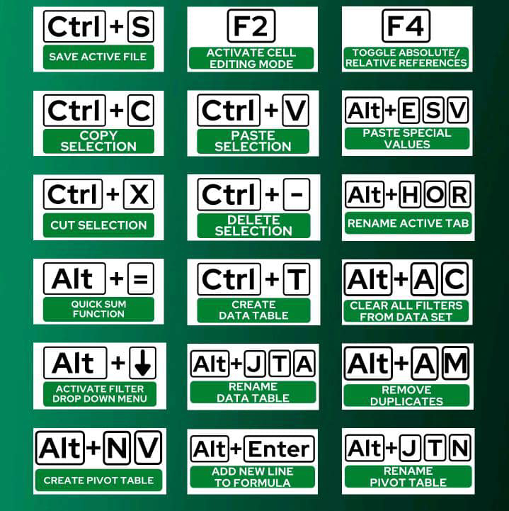
- Ctrl + N: Create a new workbook.
- Ctrl + O: Open an existing workbook.
- Ctrl + S: Save the active workbook.
- Ctrl + P: Print the active sheet.
- Ctrl + F: Open the Find and Replace dialog.
- Ctrl + H: Open the Find and Replace dialog with Replace tab.

2. Editing Shortcuts:
- F2: Edit the active cell directly.
- Ctrl + X / Ctrl + C / Ctrl + V: Cut, copy, and paste selected cells.
- Ctrl + Z / Ctrl + Y: Undo and redo actions.
- Ctrl + D: Fill down selected cells.
- Ctrl + R: Fill right selected cells.
3. Cell Selection and Navigation:
- Ctrl + Arrow Keys: Move to the edge of data regions.
- Ctrl + Space: Select the entire column of the active cell.
- Shift + Space: Select the entire row of the active cell.
4. Formatting Shortcuts:
- Ctrl + 1: Open the Format Cells dialog.
- Ctrl + B: Apply or remove bold formatting.
- Ctrl + I: Apply or remove italic formatting.
- Ctrl + U: Apply or remove underline formatting.

5. Formula and Function Shortcuts:
- Alt + = : Automatically sum selected cells.
- Ctrl + `: Toggle between displaying cell values and formulas.
- F9: Calculate the active worksheet.
- Shift + F3: Insert a function into the active cell.
6. Worksheet Navigation Shortcuts:
- Ctrl + Page Up / Page Down: Move to the previous or next worksheet.
- Ctrl + Tab: Switch to the next open workbook.

7. Pivot Table Shortcuts:
- Alt + Shift + ↓ / ↑: Expand or collapse fields in a PivotTable.
- Alt + Shift + Right Arrow: Group selected data in a PivotTable.
8. Chart Shortcuts:
- F11: Create a new chart sheet.
- Alt + F1: Create a chart of the current range.
- Ctrl + Shift + F3: Create a PivotChart from the active PivotTable.
9. Filtering and Sorting Shortcuts:
- Ctrl + Shift + L: Apply or remove filters.
- Alt + ↓ / ↑: Open the filter drop-down menu.

10. Comment Shortcuts:
-Shift + F2: Insert or edit a comment in the active cell.

11. Other Handy Shortcuts:
- Ctrl + K: Insert a hyperlink.
  Ctrl + W: Close the active workbook.
Conclusion:
Excel shortcuts are a game-changer for anyone working with spreadsheets. By incorporating these keyboard shortcuts into your workflow, you'll save time and accomplish tasks more efficiently. Print out this guide, keep it handy, and practice using these shortcuts regularly. Over time, your proficiency will increase, and you'll become a true Excel power user. Happy spreadsheeting!

Mastering Excel: Tips and Tricks for Efficient Data Management

Introduction:
Excel is a powerhouse tool that goes far beyond simple number crunching. Whether you're a beginner or a seasoned user, there are always new ways to enhance your skills and work more efficiently. In this blog, we'll delve into a collection of valuable Excel tips and tricks that will help you become a spreadsheet wizard.

1. Keyboard Shortcuts for Lightning-Fast Actions:
Save time with keyboard shortcuts. Here are a few essentials:
- Ctrl + C / Ctrl + V: Copy and paste selected cells.
- Ctrl + Z / Ctrl + Y: Undo and redo actions.
- Ctrl + Arrow Keys: Navigate to the edges of data regions.
- Ctrl + Shift + L: Apply or remove filters.
- F2: Edit the active cell directly.
I will talk about Shortcuts later. 

2. Autofill Magic:
Excel's Autofill feature can save you hours:
- Drag the fill handle (a small square at the corner of the selected cell) to auto-populate a series (numbers, dates, text).
- Double-click the fill handle to fill down or across until the next populated cell.

3. Customizing the Quick Access Toolbar:
Personalize the Quick Access Toolbar for easy access to your most-used commands:
- Click the dropdown arrow on the toolbar and select "More Commands."
- Add frequently used commands like Save, Print, or Spell Check.

4. Flash Fill for Data Transformation:
Easily split or combine data with Flash Fill:
- Type an example in an adjacent column.
- Excel will recognize the pattern and apply it to the entire column.

5. Conditional Formatting for Visual Insights:
Highlight trends and patterns with conditional formatting:
- Select a range, go to Home > Conditional VLOOKUPFormatting.
- Choose rules to apply formatting based on cell values.

6. Text to Columns for Data Separation:
Quickly split data into multiple columns:
- Select the range, go to Data > Text to Columns.
- Choose a delimiter (comma, space, etc.) and specify where to split.

7. Concatenate for Merging Text:
Combine text from different cells with the CONCATENATE function (or `&` symbol):
- Example: `=A2 & " " & B2` combines values from cells A2 and B2.

8. Named Ranges for Clarity:
Assign names to ranges for easier navigation:
- Select the range, go to Formulas > Name Manager > New.
- Use these named ranges in formulas and charts.

9. Remove Duplicates for Clean Data:
Ensure data integrity by removing duplicates:
- Select the range, go to Data > Remove Duplicates.
- Choose the columns to check for duplicates.

10. Freeze Panes for Large Worksheets:
Keep headers visible while scrolling through large datasets:
- Select the cell below and to the right of the headers.
- Go to View > Freeze Panes > Freeze Panes.

11. Quick Analysis for Instant Insights:
Select a range and use the Quick Analysis tool (bottom-right corner) to create charts, apply conditional formatting, and more.

Conclusion:
These Excel tips and tricks are just the tip of the iceberg. By incorporating these techniques into your workflow, you'll become a more efficient and capable Excel user. Remember, practice makes perfect, so don't hesitate to experiment and explore new features as you continue to master this versatile tool. Happy spreadsheeting!

Unveiling Data Insights: A Practical Guide to Excel Data Analysis

Introduction: In today's data-driven world, extracting valuable insights from raw information has become a cornerstone of decision-making. Microsoft Excel, a widely used spreadsheet software, is a powerful tool that empowers individuals and professionals to analyze data, uncover trends, and make informed choices. In this blog, we'll explore the journey of real-life data analysis using Excel, from data preparation to visualization, showcasing how this versatile tool can transform raw data into actionable insights.

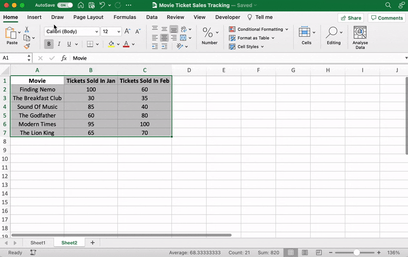
Data set
Let's go through a step-by-step analysis of this dataset using Excel:

Step 1: Data Import and Preparation
1. Open Excel and create a new worksheet.
2. Copy and paste the above tabular data into the worksheet.
3. Ensure that each column has a clear header (e.g., "Student ID," "Name," "Subject," "Score").

Step 2: Data Summarization
1. Use the SUM function to calculate the total score. In an empty cell, type `=SUM(D2:D11)` where "D2:D11" represents the range of scores.
2. Calculate the average score using the AVERAGE function: `=AVERAGE(D2:D11)`.

Step 3: Creating a Bar Chart
1. Highlight the "Subject" and "Score" columns.
2. Go to the "Insert" tab, click on "Bar Chart," and choose "Clustered Bar."
3. You will see a bar chart showing the scores for each student in the "Math" subject.

Step 4: Finding the Maximum and Minimum Scores
1. Use the MAX function to find the highest score: `=MAX(D2:D11)`.
2. Use the MIN function to find the lowest score: `=MIN(D2:D11)`.

Step 5: Data Visualization with Conditional Formatting
1. Highlight the "Score" column.
2. Go to the "Home" tab, click on "Conditional Formatting," and choose "Color Scales."
3. This will apply a color gradient to the scores, making it easier to identify high and low scores.

Step 6: PivotTable for Subject-wise Analysis
1. Highlight the entire dataset.
2. Go to the "Insert" tab, click on "PivotTable," and select the location for the PivotTable.
3. Drag "Subject" to the "Rows" area and "Score" to the "Values" area.
4. You'll get a summarized view of average scores for each subject.

Step 7: Data Analysis with Functions
1. Use COUNTIF to count the number of students who scored above 80: `=COUNTIF(D2:D11, ">80")`.
2. Use COUNTIF to count the number of students who scored below 70: `=COUNTIF(D2:D11, "<70")`.

Step 8: Hypothetical What-If Analysis
1. Create a new column header called "Adjusted Score."
2. Suppose you want to add 5 points to each student's score. In the first cell of the "Adjusted Score" column (E2), type `=D2+5`.
3. Drag the fill handle (small square at the bottom right corner of the cell) to fill the formula down the column.

These are just a few examples of the analyses you can perform with Excel using the given dataset. Depending on your needs, you can dive even deeper into the data using additional Excel functions and tools.

Day 10: Excel Mastery Reflection and Beyond

Congratulations! You've reached the final day of your "Master Excel in 10 Days" journey. Over the past nine days, you've immersed yourself in the world of Excel, from the basics to advanced techniques. Today, we'll reflect on your journey, celebrate your accomplishments, and explore the endless possibilities that lie ahead.

Reflecting on Your Excel Mastery:

Take a moment to appreciate how far you've come. You started with Excel's fundamental tools, gradually building your skills to tackle complex challenges, analyze data, and craft compelling visualizations. Your dedication and commitment have transformed you into an Excel enthusiast.

Your Accomplishments:

Day 1: You embraced the Excel basics and learned to navigate the interface.

Day 2: You dived into formatting fonts, colors, and sizes to make your spreadsheets visually appealing.

Day 3: You explored cell styles, unleashing creativity with pre-designed formats.

Day 4: You harnessed the power of conditional formatting to highlight important insights.

Day 5: You discovered the world of borders and gridlines, giving structure to your data.

Day 6: You ventured into custom number formats, mastering data representation.

Day 7: You unlocked Excel's functions, turning numbers into insights.

Day 8: You solved real-world problems using data analysis tools.

Day 9: You became a data visualization maestro, crafting engaging visual stories.


Excel Beyond the 10 Days:

As you conclude this journey, remember that Excel is a dynamic tool with boundless possibilities. Your newfound skills can be applied across industries, from finance and marketing to healthcare and education. Here's what lies ahead:


Advanced Functions: Dive deeper into Excel's functions, from INDEX/MATCH to complex array formulas.

Power Query and Power Pivot: Explore data transformation and modeling for more in-depth analysis.

VBA and Macros: Learn automation through Visual Basic for Applications (VBA) to boost efficiency.

Advanced Charts: Experiment with advanced charts like histograms, pareto charts, and radar charts.

PivotTables and PivotCharts: Master these tools for multidimensional analysis and reporting.

Machine Learning: Integrate Excel with machine learning tools for predictive analytics.


Your Excel Journey Continues:

Your journey doesn't end here—it's just the beginning. Excel is a versatile tool that adapts to your growth and curiosity. Whether you're a business analyst, student, researcher, or entrepreneur, Excel will be your ally in unlocking insights and making informed decisions.

Thank you for embarking on this "Master Excel in 10 Days" adventure with us. We hope you've gained valuable skills and the confidence to excel in your professional and personal endeavors. Keep exploring, keep learning, and keep excelling!


Day 9: Advanced Data Visualization - Crafting Engaging Visual Stories

Welcome to Day 9 of your "Master Excel in 10 Days" journey! Today, we're diving into advanced data visualization techniques that will elevate your insights and transform them into captivating visual stories. Get ready to create charts, graphs, and dashboards that speak volumes to your audience.
 

Advanced Data Visualization: The Art of Visual Storytelling:

Advanced data visualization is like painting with data, creating visual narratives that engage and inform. With these techniques, you'll master the art of conveying complex information in an engaging and impactful way.

1. Advanced Chart Types: Beyond the Basics:

Explore more sophisticated chart types that add depth and insight to your data:

- Gantt Charts: Display project schedules and timelines.
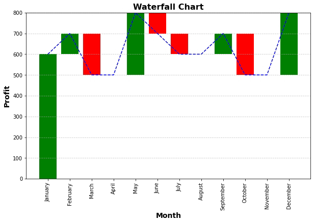
- Waterfall Charts:Visualize incremental changes in values over time.
- Heat Maps: Depict data using color intensity, ideal for large datasets.
- Bubble Charts:Show relationships between three data points using bubbles.
2. Interactive Dashboards: Insights at Your Fingertips:

Dashboards are dynamic displays of multiple charts and visualizations that provide a comprehensive overview. Here's how to create interactive dashboards:

- Plan the layout and arrangement of charts and data.
- Use PivotTables and slicers to enable interactive filtering.
- Utilize sparklines to provide trend insights within cells.

3. Conditional Formatting: Adding Context and Emphasis:

Conditional formatting goes beyond colors; it highlights trends and outliers. Here's how:

- Apply data bars, color scales, and icon sets to enhance data visualization.
- Create heat maps to show patterns and variations in your data.
- Use conditional formatting to instantly spot important insights.
Practical Tips for Advanced Data Visualization:

- Color Psychology:Choose colors that evoke the right emotions and convey meaning.
- Consistency: Maintain a consistent color scheme and design throughout your visualizations.
- Story Flow:Arrange your visualizations to guide the audience through a logical narrative.

Homework for Excel Design Masters:
- Create a Gantt chart to visualize project timelines and milestones.
- Design a heat map to display sales performance across regions and products.
- Craft an interactive dashboard that provides insights into sales, expenses, and profit.

Conclusion:

Congratulations! You've delved into the world of advanced data visualization, equipped to create compelling charts, graphs, and dashboards that captivate and inform. By mastering these techniques, you're ready to transform raw data into engaging visual stories.

As you approach the final day of your "Master Excel in 10 Days" journey, remember that advanced data visualization is your tool for making data come alive. Tomorrow, join us as we wrap up this journey with a reflection on your newfound Excel mastery and a glimpse into further possibilities. Until then, keep crafting visual narratives that resonate with your audience!

Collaborative Excel: Harnessing the Power of Collaboration Features

Real-Time Co-Authoring Section 1: Enabling Real-Time Co-Authoring - *How to set up co-authoring in Excel:* To enable co-authorin...