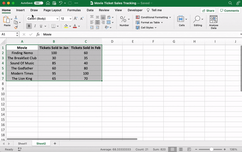
Introduction: In today's data-driven world, extracting valuable insights from raw information has become a cornerstone of decision-making. Microsoft Excel, a widely used spreadsheet software, is a powerful tool that empowers individuals and professionals to analyze data, uncover trends, and make informed choices. In this blog, we'll explore the journey of real-life data analysis using Excel, from data preparation to visualization, showcasing how this versatile tool can transform raw data into actionable insights.
Data set
Let's go through a step-by-step analysis of this dataset using Excel:
Step 1: Data Import and Preparation
1. Open Excel and create a new worksheet.
2. Copy and paste the above tabular data into the worksheet.
3. Ensure that each column has a clear header (e.g., "Student ID," "Name," "Subject," "Score").
Step 2: Data Summarization
1. Use the SUM function to calculate the total score. In an empty cell, type `=SUM(D2:D11)` where "D2:D11" represents the range of scores.
2. Calculate the average score using the AVERAGE function: `=AVERAGE(D2:D11)`.
Step 3: Creating a Bar Chart
1. Highlight the "Subject" and "Score" columns.
2. Go to the "Insert" tab, click on "Bar Chart," and choose "Clustered Bar."
3. You will see a bar chart showing the scores for each student in the "Math" subject.
Step 4: Finding the Maximum and Minimum Scores
1. Use the MAX function to find the highest score: `=MAX(D2:D11)`.
2. Use the MIN function to find the lowest score: `=MIN(D2:D11)`.
Step 5: Data Visualization with Conditional Formatting
1. Highlight the "Score" column.
2. Go to the "Home" tab, click on "Conditional Formatting," and choose "Color Scales."
3. This will apply a color gradient to the scores, making it easier to identify high and low scores.
Step 6: PivotTable for Subject-wise Analysis
1. Highlight the entire dataset.
2. Go to the "Insert" tab, click on "PivotTable," and select the location for the PivotTable.
3. Drag "Subject" to the "Rows" area and "Score" to the "Values" area.
4. You'll get a summarized view of average scores for each subject.
Step 7: Data Analysis with Functions
1. Use COUNTIF to count the number of students who scored above 80: `=COUNTIF(D2:D11, ">80")`.
2. Use COUNTIF to count the number of students who scored below 70: `=COUNTIF(D2:D11, "<70")`.
Step 8: Hypothetical What-If Analysis
1. Create a new column header called "Adjusted Score."
2. Suppose you want to add 5 points to each student's score. In the first cell of the "Adjusted Score" column (E2), type `=D2+5`.
3. Drag the fill handle (small square at the bottom right corner of the cell) to fill the formula down the column.
These are just a few examples of the analyses you can perform with Excel using the given dataset. Depending on your needs, you can dive even deeper into the data using additional Excel functions and tools.


No comments:
Post a Comment