Welcome to Day 9 of your "Master Excel in 10 Days" journey! Today, we're diving into advanced data visualization techniques that will elevate your insights and transform them into captivating visual stories. Get ready to create charts, graphs, and dashboards that speak volumes to your audience.
Advanced Data Visualization: The Art of Visual Storytelling:
Advanced data visualization is like painting with data, creating visual narratives that engage and inform. With these techniques, you'll master the art of conveying complex information in an engaging and impactful way.
1. Advanced Chart Types: Beyond the Basics:
Explore more sophisticated chart types that add depth and insight to your data:
- Gantt Charts: Display project schedules and timelines.
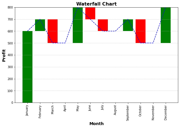
- Waterfall Charts:Visualize incremental changes in values over time.
- Heat Maps: Depict data using color intensity, ideal for large datasets.
- Bubble Charts:Show relationships between three data points using bubbles.
2. Interactive Dashboards: Insights at Your Fingertips:
Dashboards are dynamic displays of multiple charts and visualizations that provide a comprehensive overview. Here's how to create interactive dashboards:
- Plan the layout and arrangement of charts and data.
- Use PivotTables and slicers to enable interactive filtering.
- Utilize sparklines to provide trend insights within cells.
3. Conditional Formatting: Adding Context and Emphasis:
Conditional formatting goes beyond colors; it highlights trends and outliers. Here's how:
- Apply data bars, color scales, and icon sets to enhance data visualization.
- Create heat maps to show patterns and variations in your data.
- Use conditional formatting to instantly spot important insights.
Practical Tips for Advanced Data Visualization:
- Color Psychology:Choose colors that evoke the right emotions and convey meaning.
- Consistency: Maintain a consistent color scheme and design throughout your visualizations.
- Story Flow:Arrange your visualizations to guide the audience through a logical narrative.
Homework for Excel Design Masters:
- Create a Gantt chart to visualize project timelines and milestones.
- Design a heat map to display sales performance across regions and products.
- Craft an interactive dashboard that provides insights into sales, expenses, and profit.
Conclusion:
Congratulations! You've delved into the world of advanced data visualization, equipped to create compelling charts, graphs, and dashboards that captivate and inform. By mastering these techniques, you're ready to transform raw data into engaging visual stories.
As you approach the final day of your "Master Excel in 10 Days" journey, remember that advanced data visualization is your tool for making data come alive. Tomorrow, join us as we wrap up this journey with a reflection on your newfound Excel mastery and a glimpse into further possibilities. Until then, keep crafting visual narratives that resonate with your audience!


No comments:
Post a Comment