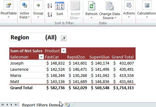
Microsoft Excel is a powerful tool for data analysis and visualization. Among its many features, Pivot Tables and Charts stand out as essential tools for anyone looking to analyze and present data effectively. In this blog, we'll dive deep into these two features, exploring how to create, customize, and leverage them to gain valuable insights from your data.
Part 1: Pivot Tables
What is a Pivot Table?
A Pivot Table is a data processing tool that allows you to summarize, analyze, and rearrange data from a spreadsheet or database. It's particularly useful for handling large datasets with numerous variables. Here's how to create a Pivot Table:
1. Select Your Data: Begin by selecting the data range you want to analyze.
2. Insert Pivot Table: Go to the "Insert" tab and select "Pivot Table."
3. Choose Rows and Values: Drag and drop fields into the Rows and Values areas. You can apply various calculations (e.g., sum, average) to the values.
4. Customize Your Pivot Table: Format, filter, and sort your Pivot Table to fit your needs.
Benefits of Pivot Tables
- Simplify Data Analysis: Pivot Tables provide a clear and concise way to summarize and explore data, making it easier to identify trends and patterns.
- Dynamic Updates: When your source data changes, Pivot Tables can be updated with a simple click, ensuring your analysis remains current.
- Customization: You have full control over the layout and calculations within your Pivot Table, tailoring it to your specific requirements.
Part 2: Pivot Charts
What is a pivot Chart?
Pivot Charts complement Pivot Tables by offering visual representations of the summarized data. They allow for a quick, intuitive understanding of complex datasets. To create a Pivot Chart:
1. Create a Pivot Table: Before generating a Pivot Chart, you need to create a Pivot Table.
2. Insert Pivot Chart: With the Pivot Table selected, go to the "Insert" tab and choose the chart type that suits your data.
3. Customize Your Pivot Chart: Like regular Excel charts, you can customize colors, labels, and other chart elements.
Benefits of Pivot Charts
- Data Visualization: Pivot Charts transform data into visually appealing graphs, making it easier to communicate findings to others.
- Interactivity: You can interact with Pivot Charts linked to Pivot Tables, enabling you to explore data in real-time.
Part 3: Advanced Tips
1. Slicers
Slicers are visual filters that allow users to interactively filter Pivot Tables and Charts. They enhance the user experience and enable quick data exploration.
2. Grouping Data
You can group data in Pivot Tables by dates, numbers, or custom categories, simplifying the analysis of large datasets.
4. Pivot Charts Styles
Experiment with different chart styles to find the one that best conveys your data's message.
Certainly! Measures and Calculated Columns are powerful tools in Excel that can enhance your data analysis capabilities. Let's briefly explore how they can be used alongside Pivot Tables and Charts:
Part 4: Measures and Calculated Columns
Measures
Measures are dynamic calculations applied to data within a Pivot Table. They allow you to perform calculations on the fly without altering your source data. Here's how to use measures:
1. Create a Pivot Table: Start by creating a Pivot Table as usual.
2. Insert Measure**: Right-click on your Pivot Table and select "Add Measure" or "New Measure" (depending on your Excel version).
3. Define the Calculation: Write a formula for your measure. For example, you can calculate the total sales, average profit margin, or growth rate.
4. Use Measures in Pivot Tables: Once defined, measures can be used as values within your Pivot Table, enabling you to perform calculations without altering the underlying data.
Calculated Columns
Calculated Columns, on the other hand, allow you to add new columns to your dataset based on custom calculations. Here's how to use calculated columns:
1. Select Your Data: Start by selecting the data range where you want to add a calculated column.
2. Insert Calculated Column: Go to the "Data" tab, click "Get & Transform Data" (Power Query), and select "Add Column" > "Custom Column."
3. Define the Calculation: In the formula bar, write the formula for your calculated column. This can involve combining existing columns, performing mathematical operations, or applying conditional logic.
4. Apply the Calculated Column: The calculated column is now part of your dataset and can be used in Pivot Tables, Charts, or any other data analysis tasks.
Benefits of Measures and Calculated Columns
- Flexibility: Measures and Calculated Columns provide flexibility in data analysis by allowing you to perform custom calculations to derive meaningful insights.
- Reusability: Once created, measures and calculated columns can be reused across different Pivot Tables and Charts, saving time and effort.
- Enhanced Insights: These features enable you to perform complex calculations, aggregations, and transformations, opening up new avenues for data analysis.
Incorporating measures and calculated columns into your Excel data analysis toolkit alongside Pivot Tables and Charts can greatly expand your ability to uncover valuable insights and make more informed decisions based on your data. Experiment with these tools to discover their full potential in your data analysis workflow.
Conclusion
Excel's Pivot Tables and Charts are indispensable tools for anyone working with data. They empower users to analyze, summarize, and visualize data efficiently. By mastering these features and their advanced capabilities, you can transform raw data into valuable insights that drive informed decision-making. So, start exploring and harnessing the power of Pivot Tables and Charts in Excel today!


No comments:
Post a Comment