Excel Shortcuts Guide: Boost Your Productivity with Handy Keyboard Shortcuts

Introduction:
Excel is a versatile tool for data management, analysis, and visualization. To make the most of your time, mastering keyboard shortcuts is essential. In this comprehensive guide, we'll walk you through a wide range of Excel shortcuts that will streamline your tasks and boost your productivity.

1. Basic Navigation Shortcuts:
- Ctrl + N: Create a new workbook.
- Ctrl + O: Open an existing workbook.
- Ctrl + S: Save the active workbook.
- Ctrl + P: Print the active sheet.
- Ctrl + F: Open the Find and Replace dialog.
- Ctrl + H: Open the Find and Replace dialog with Replace tab.

2. Editing Shortcuts:
- F2: Edit the active cell directly.
- Ctrl + X / Ctrl + C / Ctrl + V: Cut, copy, and paste selected cells.
- Ctrl + Z / Ctrl + Y: Undo and redo actions.
- Ctrl + D: Fill down selected cells.
- Ctrl + R: Fill right selected cells.
3. Cell Selection and Navigation:
- Ctrl + Arrow Keys: Move to the edge of data regions.
- Ctrl + Space: Select the entire column of the active cell.
- Shift + Space: Select the entire row of the active cell.
4. Formatting Shortcuts:
- Ctrl + 1: Open the Format Cells dialog.
- Ctrl + B: Apply or remove bold formatting.
- Ctrl + I: Apply or remove italic formatting.
- Ctrl + U: Apply or remove underline formatting.

5. Formula and Function Shortcuts:
- Alt + = : Automatically sum selected cells.
- Ctrl + `: Toggle between displaying cell values and formulas.
- F9: Calculate the active worksheet.
- Shift + F3: Insert a function into the active cell.
6. Worksheet Navigation Shortcuts:
- Ctrl + Page Up / Page Down: Move to the previous or next worksheet.
- Ctrl + Tab: Switch to the next open workbook.

7. Pivot Table Shortcuts:
- Alt + Shift + ↓ / ↑: Expand or collapse fields in a PivotTable.
- Alt + Shift + Right Arrow: Group selected data in a PivotTable.
8. Chart Shortcuts:
- F11: Create a new chart sheet.
- Alt + F1: Create a chart of the current range.
- Ctrl + Shift + F3: Create a PivotChart from the active PivotTable.
9. Filtering and Sorting Shortcuts:
- Ctrl + Shift + L: Apply or remove filters.
- Alt + ↓ / ↑: Open the filter drop-down menu.

10. Comment Shortcuts:
-Shift + F2: Insert or edit a comment in the active cell.

11. Other Handy Shortcuts:
- Ctrl + K: Insert a hyperlink.
  Ctrl + W: Close the active workbook.
Conclusion:
Excel shortcuts are a game-changer for anyone working with spreadsheets. By incorporating these keyboard shortcuts into your workflow, you'll save time and accomplish tasks more efficiently. Print out this guide, keep it handy, and practice using these shortcuts regularly. Over time, your proficiency will increase, and you'll become a true Excel power user. Happy spreadsheeting!

Mastering Excel: Tips and Tricks for Efficient Data Management

Introduction:
Excel is a powerhouse tool that goes far beyond simple number crunching. Whether you're a beginner or a seasoned user, there are always new ways to enhance your skills and work more efficiently. In this blog, we'll delve into a collection of valuable Excel tips and tricks that will help you become a spreadsheet wizard.

1. Keyboard Shortcuts for Lightning-Fast Actions:
Save time with keyboard shortcuts. Here are a few essentials:
- Ctrl + C / Ctrl + V: Copy and paste selected cells.
- Ctrl + Z / Ctrl + Y: Undo and redo actions.
- Ctrl + Arrow Keys: Navigate to the edges of data regions.
- Ctrl + Shift + L: Apply or remove filters.
- F2: Edit the active cell directly.
I will talk about Shortcuts later. 

2. Autofill Magic:
Excel's Autofill feature can save you hours:
- Drag the fill handle (a small square at the corner of the selected cell) to auto-populate a series (numbers, dates, text).
- Double-click the fill handle to fill down or across until the next populated cell.

3. Customizing the Quick Access Toolbar:
Personalize the Quick Access Toolbar for easy access to your most-used commands:
- Click the dropdown arrow on the toolbar and select "More Commands."
- Add frequently used commands like Save, Print, or Spell Check.

4. Flash Fill for Data Transformation:
Easily split or combine data with Flash Fill:
- Type an example in an adjacent column.
- Excel will recognize the pattern and apply it to the entire column.

5. Conditional Formatting for Visual Insights:
Highlight trends and patterns with conditional formatting:
- Select a range, go to Home > Conditional VLOOKUPFormatting.
- Choose rules to apply formatting based on cell values.

6. Text to Columns for Data Separation:
Quickly split data into multiple columns:
- Select the range, go to Data > Text to Columns.
- Choose a delimiter (comma, space, etc.) and specify where to split.

7. Concatenate for Merging Text:
Combine text from different cells with the CONCATENATE function (or `&` symbol):
- Example: `=A2 & " " & B2` combines values from cells A2 and B2.

8. Named Ranges for Clarity:
Assign names to ranges for easier navigation:
- Select the range, go to Formulas > Name Manager > New.
- Use these named ranges in formulas and charts.

9. Remove Duplicates for Clean Data:
Ensure data integrity by removing duplicates:
- Select the range, go to Data > Remove Duplicates.
- Choose the columns to check for duplicates.

10. Freeze Panes for Large Worksheets:
Keep headers visible while scrolling through large datasets:
- Select the cell below and to the right of the headers.
- Go to View > Freeze Panes > Freeze Panes.

11. Quick Analysis for Instant Insights:
Select a range and use the Quick Analysis tool (bottom-right corner) to create charts, apply conditional formatting, and more.

Conclusion:
These Excel tips and tricks are just the tip of the iceberg. By incorporating these techniques into your workflow, you'll become a more efficient and capable Excel user. Remember, practice makes perfect, so don't hesitate to experiment and explore new features as you continue to master this versatile tool. Happy spreadsheeting!

Unveiling Data Insights: A Practical Guide to Excel Data Analysis

Introduction: In today's data-driven world, extracting valuable insights from raw information has become a cornerstone of decision-making. Microsoft Excel, a widely used spreadsheet software, is a powerful tool that empowers individuals and professionals to analyze data, uncover trends, and make informed choices. In this blog, we'll explore the journey of real-life data analysis using Excel, from data preparation to visualization, showcasing how this versatile tool can transform raw data into actionable insights.

Data set
Let's go through a step-by-step analysis of this dataset using Excel:

Step 1: Data Import and Preparation
1. Open Excel and create a new worksheet.
2. Copy and paste the above tabular data into the worksheet.
3. Ensure that each column has a clear header (e.g., "Student ID," "Name," "Subject," "Score").

Step 2: Data Summarization
1. Use the SUM function to calculate the total score. In an empty cell, type `=SUM(D2:D11)` where "D2:D11" represents the range of scores.
2. Calculate the average score using the AVERAGE function: `=AVERAGE(D2:D11)`.

Step 3: Creating a Bar Chart
1. Highlight the "Subject" and "Score" columns.
2. Go to the "Insert" tab, click on "Bar Chart," and choose "Clustered Bar."
3. You will see a bar chart showing the scores for each student in the "Math" subject.

Step 4: Finding the Maximum and Minimum Scores
1. Use the MAX function to find the highest score: `=MAX(D2:D11)`.
2. Use the MIN function to find the lowest score: `=MIN(D2:D11)`.

Step 5: Data Visualization with Conditional Formatting
1. Highlight the "Score" column.
2. Go to the "Home" tab, click on "Conditional Formatting," and choose "Color Scales."
3. This will apply a color gradient to the scores, making it easier to identify high and low scores.

Step 6: PivotTable for Subject-wise Analysis
1. Highlight the entire dataset.
2. Go to the "Insert" tab, click on "PivotTable," and select the location for the PivotTable.
3. Drag "Subject" to the "Rows" area and "Score" to the "Values" area.
4. You'll get a summarized view of average scores for each subject.

Step 7: Data Analysis with Functions
1. Use COUNTIF to count the number of students who scored above 80: `=COUNTIF(D2:D11, ">80")`.
2. Use COUNTIF to count the number of students who scored below 70: `=COUNTIF(D2:D11, "<70")`.

Step 8: Hypothetical What-If Analysis
1. Create a new column header called "Adjusted Score."
2. Suppose you want to add 5 points to each student's score. In the first cell of the "Adjusted Score" column (E2), type `=D2+5`.
3. Drag the fill handle (small square at the bottom right corner of the cell) to fill the formula down the column.

These are just a few examples of the analyses you can perform with Excel using the given dataset. Depending on your needs, you can dive even deeper into the data using additional Excel functions and tools.

Day 10: Excel Mastery Reflection and Beyond

Congratulations! You've reached the final day of your "Master Excel in 10 Days" journey. Over the past nine days, you've immersed yourself in the world of Excel, from the basics to advanced techniques. Today, we'll reflect on your journey, celebrate your accomplishments, and explore the endless possibilities that lie ahead.

Reflecting on Your Excel Mastery:

Take a moment to appreciate how far you've come. You started with Excel's fundamental tools, gradually building your skills to tackle complex challenges, analyze data, and craft compelling visualizations. Your dedication and commitment have transformed you into an Excel enthusiast.

Your Accomplishments:

Day 1: You embraced the Excel basics and learned to navigate the interface.

Day 2: You dived into formatting fonts, colors, and sizes to make your spreadsheets visually appealing.

Day 3: You explored cell styles, unleashing creativity with pre-designed formats.

Day 4: You harnessed the power of conditional formatting to highlight important insights.

Day 5: You discovered the world of borders and gridlines, giving structure to your data.

Day 6: You ventured into custom number formats, mastering data representation.

Day 7: You unlocked Excel's functions, turning numbers into insights.

Day 8: You solved real-world problems using data analysis tools.

Day 9: You became a data visualization maestro, crafting engaging visual stories.


Excel Beyond the 10 Days:

As you conclude this journey, remember that Excel is a dynamic tool with boundless possibilities. Your newfound skills can be applied across industries, from finance and marketing to healthcare and education. Here's what lies ahead:


Advanced Functions: Dive deeper into Excel's functions, from INDEX/MATCH to complex array formulas.

Power Query and Power Pivot: Explore data transformation and modeling for more in-depth analysis.

VBA and Macros: Learn automation through Visual Basic for Applications (VBA) to boost efficiency.

Advanced Charts: Experiment with advanced charts like histograms, pareto charts, and radar charts.

PivotTables and PivotCharts: Master these tools for multidimensional analysis and reporting.

Machine Learning: Integrate Excel with machine learning tools for predictive analytics.


Your Excel Journey Continues:

Your journey doesn't end here—it's just the beginning. Excel is a versatile tool that adapts to your growth and curiosity. Whether you're a business analyst, student, researcher, or entrepreneur, Excel will be your ally in unlocking insights and making informed decisions.

Thank you for embarking on this "Master Excel in 10 Days" adventure with us. We hope you've gained valuable skills and the confidence to excel in your professional and personal endeavors. Keep exploring, keep learning, and keep excelling!


Day 9: Advanced Data Visualization - Crafting Engaging Visual Stories

Welcome to Day 9 of your "Master Excel in 10 Days" journey! Today, we're diving into advanced data visualization techniques that will elevate your insights and transform them into captivating visual stories. Get ready to create charts, graphs, and dashboards that speak volumes to your audience.
 

Advanced Data Visualization: The Art of Visual Storytelling:

Advanced data visualization is like painting with data, creating visual narratives that engage and inform. With these techniques, you'll master the art of conveying complex information in an engaging and impactful way.

1. Advanced Chart Types: Beyond the Basics:

Explore more sophisticated chart types that add depth and insight to your data:

- Gantt Charts: Display project schedules and timelines.
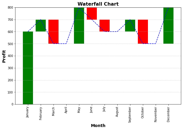
- Waterfall Charts:Visualize incremental changes in values over time.
- Heat Maps: Depict data using color intensity, ideal for large datasets.
- Bubble Charts:Show relationships between three data points using bubbles.
2. Interactive Dashboards: Insights at Your Fingertips:

Dashboards are dynamic displays of multiple charts and visualizations that provide a comprehensive overview. Here's how to create interactive dashboards:

- Plan the layout and arrangement of charts and data.
- Use PivotTables and slicers to enable interactive filtering.
- Utilize sparklines to provide trend insights within cells.

3. Conditional Formatting: Adding Context and Emphasis:

Conditional formatting goes beyond colors; it highlights trends and outliers. Here's how:

- Apply data bars, color scales, and icon sets to enhance data visualization.
- Create heat maps to show patterns and variations in your data.
- Use conditional formatting to instantly spot important insights.
Practical Tips for Advanced Data Visualization:

- Color Psychology:Choose colors that evoke the right emotions and convey meaning.
- Consistency: Maintain a consistent color scheme and design throughout your visualizations.
- Story Flow:Arrange your visualizations to guide the audience through a logical narrative.

Homework for Excel Design Masters:
- Create a Gantt chart to visualize project timelines and milestones.
- Design a heat map to display sales performance across regions and products.
- Craft an interactive dashboard that provides insights into sales, expenses, and profit.

Conclusion:

Congratulations! You've delved into the world of advanced data visualization, equipped to create compelling charts, graphs, and dashboards that captivate and inform. By mastering these techniques, you're ready to transform raw data into engaging visual stories.

As you approach the final day of your "Master Excel in 10 Days" journey, remember that advanced data visualization is your tool for making data come alive. Tomorrow, join us as we wrap up this journey with a reflection on your newfound Excel mastery and a glimpse into further possibilities. Until then, keep crafting visual narratives that resonate with your audience!

Day 8: Data Analysis Tools - Solving Real-World Problems

Welcome to Day 8 of your "Master Excel in 10 Days" journey! Today, we're delving into the realm of data analysis tools that empower you to solve real-world problems efficiently. Get ready to use scenarios, goal seek, and solver to make informed decisions and find optimal solutions.

Data Analysis Tools: Navigating Complex Challenges:

Data analysis tools in Excel are like your navigational compass through complex scenarios. They allow you to explore different options, optimize outcomes, and tackle intricate challenges.

1. Scenarios: Exploring What-If Scenarios:

Scenarios enable you to examine various "what-if" situations by changing input values and observing their impact on outcomes. Here's how:
- Go to the "Data" tab and click on "What-If Analysis."
- Choose "Scenario Manager" to define and manage different scenarios.
- Create scenarios with different variables and input values, then compare results.

2. Goal Seek: Reaching Desired Outcomes:

Goal Seek lets you set a target outcome and determine the input value needed to achieve it. Here's how:
- Go to the "Data" tab and click on "What-If Analysis."
- Choose "Goal Seek" and set the desired result.
- Specify the target cell and the cell you want to adjust. Excel will find the required input value.

3. Solver: Optimizing Complex Problems:

Solver is your tool for optimizing decisions in intricate situations, such as resource allocation or cost minimization. Here's how:
- Go to the "Data" tab and click on "Solver."
- Define the objective (maximize, minimize) and set constraints.
- Click "Solve," and Excel will find the optimal solution that meets your criteria.

Practical Tips for Using Data Analysis Tools:

- Scenario Labels: Give your scenarios meaningful names for easy reference.
- Goal Seek Sensitivity:Goal Seek may not find a solution if the target outcome is too far from the initial value.
- Solver Precision: Adjust Solver settings for more accurate solutions.

Homework for Excel Problem Solvers:

- Create a scenario to analyze the impact of changing interest rates on loan payments.
- Use Goal Seek to determine the required sales volume to achieve a specific profit target.
- Solve a resource allocation problem using Solver to find the optimal distribution.

Conclusion:

Congratulations! You've conquered the world of data analysis tools, equipped to tackle complex challenges and optimize outcomes. By harnessing the power of scenarios, goal seek, and solver, you're ready to make informed decisions and find optimal solutions.

As you continue your "Master Excel in 10 Days" journey, remember that data analysis tools are your allies in the quest for insights and optimization. Tomorrow, join us as we explore data visualization techniques that will transform your insights into captivating visual stories. Until then, keep exploring, experimenting, and problem-solving with Excel's data analysis tools!

Day 7: Mastering Formulas and Functions - Excel's Computational Magic

Welcome to Day 7 of your "Master Excel in 10 Days" journey! Today, we're diving deep into the heart of Excel's power: formulas and functions. Get ready to harness the magic of calculations, automate tasks, and unleash Excel's computational capabilities.

Formulas and Functions: Your Excel Superpowers:

Formulas and functions are the building blocks of Excel. They enable you to perform complex calculations, analyze data, and automate tasks, making you a true Excel superhero.

1. Building Formulas: Creating Mathematical Marvels:

Formulas are equations that perform calculations using values in your spreadsheet. Here's how to create a formula:
- Start a cell with an equal sign (=).
- Enter the mathematical expression using cell references, operators, and functions.

2. Essential Functions: Excel's Ready-Made Tools:

Excel offers a wide range of functions that perform specific tasks. Here are some essential ones:
1. SUM: Adds up a range of numbers.
   Example: =SUM(A1:A10)

2. AVERAGE: Calculates the average of a range of numbers.
   Example: =AVERAGE(B1:B5)

3. COUNT: Counts the number of cells with numeric values in a range.
   Example: =COUNT(C1:C20)

4. MAX: Returns the highest value in a range.
   Example: =MAX(D1:D15)

5. MIN: Returns the lowest value in a range.
   Example: =MIN(E1:E12)

6. IF: Performs a conditional test and returns different values based on the result.
   Example: =IF(F2>50, "Pass", "Fail")

7. VLOOKUP: Searches for a value in a table and returns a corresponding value from a different column.
   Example: =VLOOKUP(G2, A1:B10, 2, FALSE)

8. CONCATENATE (or CONCAT): Joins together multiple text strings.
   Example: =CONCATENATE("Hello", " ", "world")

9. TEXT: Converts a number into text with a specified format.
   Example: =TEXT(H2, "0.00%")

10. SUMIF: Adds up values in a range based on a specified condition.
    Example: =SUMIF(I1:I10, ">100", I1:I10)
Of course, here are 10 more Excel functions with examples:

11. COUNTIF: Counts the number of cells that meet a specific condition.
    Example: =COUNTIF(A1:A20, ">50")

12. INDEX: Returns the value of a cell in a specified row and column of a range.
    Example: =INDEX(B1:D10, 3, 2)

13. MATCH: Searches for a value in a range and returns its relative position.
    Example: =MATCH("Apples", A1:A10, 0)

14. LEFT: Extracts a specified number of characters from the beginning of a text string.
    Example: =LEFT(C2, 5)

15. RIGHT: Extracts a specified number of characters from the end of a text string.
    Example: =RIGHT(D2, 3)

16. MID: Extracts a specified number of characters from a text string, starting at a specified position.
    Example: =MID(E2, 3, 4)

17. CONCATENATE (or CONCAT): Joins together multiple text strings.
    Example: =CONCATENATE("Hello", " ", "world")

18. DATE: Returns the current date.
    Example: =DATE(2023, 8, 26)

19. TIME: Returns the current time.
    Example: =TIME(15, 30, 0)

20. SUMIFS: Adds up values in a range based on multiple specified conditions.
    Example: =SUMIFS(F1:F20, A1:A20, "Apples", B1:B20, "High")

21. XLOOKUP: A versatile function for searching a value in a range and returning a corresponding value from another range, with advanced features.
    Example: =XLOOKUP("Apples", A1:A10, B1:B10, "Not Found", 0)

22. HSTACK (HORIZONTAL STACK): Combines ranges horizontally to create a new range.
    Example: =HSTACK(A1:A5, B1:B5)

23. VSTACK (VERTICAL STACK): Combines ranges vertically to create a new range.
    Example: =VSTACK(A1:A5, B1:B5)

These functions can be particularly helpful for manipulating and consolidating data in your Excel spreadsheets.

3. Nesting Functions: Supercharge Your Formulas:

Nesting involves using one function as an argument in another. This allows for intricate calculations and dynamic data analysis.

Practical Tips for Formula Mastery:

- Use Cell References:Refer to cells by their references to create dynamic formulas.
- Parentheses: Use parentheses to control the order of operations in complex formulas.
- Practice, Practice, Practice:Experiment with different functions and formulas to enhance your skills.

Homework for Excel Explorers:

- Create a formula that calculates the total cost of items using quantity and price.
- Use the AVERAGE function to find the average of a range of numbers.
- Implement the IF function to display "Pass" or "Fail" based on a student's score.
- Try nesting functions by using the SUM and AVERAGE functions together.

Conclusion:

Congratulations! You've unlocked the true power of Excel by mastering formulas and functions. By building complex calculations and automating processes, you're equipped to tackle data challenges and perform intricate tasks efficiently.

As you continue your "Master Excel in 10 Days" journey, remember that formulas and functions are your tools for transforming data into insights. Tomorrow, join us as we delve into the world of data analysis tools, including scenarios, goal seek, and solver, enabling you to solve real-world problems with precision. Until then, keep exploring and experimenting with formulas and functions!

Day 5: Unleashing the Power of PivotTables -data analysis! Analysis Made Simple


Welcome to Day 5 of your "Master Excel in 10 Days" journey! Today, we're diving deep into the world of PivotTables, a versatile tool that empowers you to analyze and summarize data effortlessly. Get ready to unlock valuable insights from your data like never before.

PivotTables: Your Data Analysis Swiss Army Knife:

PivotTables are like a magic wand for data analysis. They allow you to quickly transform vast amounts of data into meaningful summaries, enabling you to make informed decisions and uncover hidden trends.

1. Creating a PivotTable: Turning Data into Insights:

Here's how to create a PivotTable from your data:
- Select the data range you want to analyze.
- Go to the "Insert" tab and click on "PivotTable."
- Choose where you want to place the PivotTable and customize its layout.

2. Analyzing Data: The PivotTable Playground:

Once you've created a PivotTable, the possibilities are endless:
- Row Labels:Drag fields to the "Rows" area to categorize data.
- Column Labels:Organize data by columns for better comparison.
- Values: Summarize data using functions like Sum, Average, Count, and more.
- Filters: Apply filters to focus on specific data subsets.

3. Customizing PivotTables: Tailoring Insights to Your Needs:

PivotTables can be tailored to answer specific questions and provide relevant insights:
- Value Field Settings: Choose aggregation methods like Sum, Average, or Max.
- Column and Row Layout:Rearrange fields to change the PivotTable's structure.
- Slicers and Timelines: Add interactivity with slicers for easy filtering.

Practical Tips for Using PivotTables Effectively:

- Clean Data:Ensure your data is well-organized and free from errors.
- Refresh Data:If your data changes, refresh your PivotTable to reflect the updates.
- Experiment:Don't hesitate to rearrange fields and experiment with different layouts.

Homework for Excel Explorers:

- Open a data set with multiple columns and rows.
- Create a PivotTable that summarizes data based on specific criteria.
- Experiment with different row labels, column labels, and values.
- Try adding a slicer to enhance interactivity.

Conclusion:

Congratulations! You've delved into the world of PivotTables and unlocked the ability to analyze and summarize data with ease. By mastering this tool, you're equipped to uncover trends, patterns, and insights that drive smarter decision-making.

As you continue your "Master Excel in 10 Days" journey, remember that PivotTables are your ultimate companion for data exploration and analysis. Tomorrow, join us as we explore the world of data validation, ensuring your data remains accurate and consistent. Until then, keep honing your PivotTable skills and embracing the power of data analysis!

Day 4: Visualizing Data - Creating Compelling Charts and Graphs


Welcome to Day 4 of your "Master Excel in 10 Days" journey! Today, we're stepping into the realm of data visualization, where numbers come to life and insights are easily accessible. Get ready to learn the art of transforming raw data into meaningful charts and graphs that tell a compelling story.

The Power of Data Visualization: Painting with Numbers:

Data visualization is your canvas for storytelling. It allows you to showcase trends, comparisons, and patterns in a way that's visually engaging and easy to understand. By mastering the art of creating charts and graphs, you'll be able to communicate your insights with impact.

1. Chart Types and When to Use Them:

Different chart types serve different purposes. Here are some common ones and their applications:
- Column Charts:Compare values across different categories.
- Line Charts:Display trends and changes over time.
- Pie Charts: Illustrate proportions and percentages.
- Bar Charts:Similar to column charts but horizontal.
- Area Charts: Depict cumulative totals and trends.
- Scatter Plots: Show relationships between two variables.

2. Creating Compelling Charts:

Creating a chart involves selecting your data and choosing the appropriate chart type. Here's how:
- Select the data range you want to visualize.
- Click on the "Insert" tab and choose the desired chart type.
- Customize the chart elements, such as titles, labels, and legends.
- Format the chart to match your desired style.

3. Enhancing Visual Appeal:

Making your charts visually appealing is just as important as conveying the data:
- Use colors effectively to highlight key points.
- Add data labels to provide context and specifics.
- Include a title that summarizes the chart's purpose.
- Keep it simple and avoid clutter.

Practical Tips for Creating Impactful Charts:

- Choose the Right Chart: Select the chart type that best represents your data and message.
- Limit Data: Avoid overwhelming the audience with too much data on one chart.
- Consistent Scales: Ensure consistent scales and units on your axes.
- Annotations: Use arrows or text boxes to emphasize specific points.

Homework for Excel Designers:

- Open a sample data set with numerical values.
- Create a column chart to compare values across different categories.
- Generate a line chart to showcase trends over a specific period.
- Experiment with pie charts to visualize proportions.

Conclusion:

Congratulations! You've ventured into the captivating world of data visualization. By mastering the art of creating charts and graphs, you're now equipped to transform raw data into compelling narratives. Remember that effective visualization isn't just about aesthetics; it's about delivering insights that resonate with your audience.

Tomorrow, join us as we explore the fascinating world of PivotTables, enabling you to slice, dice, and summarize your data effortlessly. Until then, keep experimenting and enhancing your data visualization skills!

Day 3: Organizing Your Data - The Art of Sorting, Filtering, and Grouping


Welcome to Day 3 of your "Master Excel in 10 Days" journey! After diving into formatting, today we're
shifting our focus to the world of data management. Get ready to unlock the power of sorting, filtering, and grouping, allowing you to arrange your data with precision and extract valuable insights.

The Essence of Data Management:

Data without organization is like a puzzle with missing pieces. Efficient data management is about creating order from chaos, enabling you to analyze and interpret your information effortlessly. By the end of today, you'll be equipped to navigate through your data like a seasoned pro.

1. Sorting Data: Putting Things in Order:

  • Sorting arranges your data in a specified order, making it easier to spot patterns, trends, and outliers:
  •  Ascending Order: Arrange data from smallest to largest (A-Z or 0-9).
  • Descending Order: Arrange data from largest to smallest (Z-A or 9-0).
  • Multi-Level Sorting: Sort by multiple criteria to achieve a more nuanced arrangement.

2. Filtering Data: Unveiling Insights:

Filters are your magnifying glass for data analysis. They help you focus on specific subsets of data:

AutoFilter: Quickly filter data based on predefined criteria.

Custom Filters: Define your own filtering criteria to uncover specific patterns.

3. Grouping Data: Creating Meaningful Clusters:

Grouping allows you to summarize and analyze large data sets by creating meaningful clusters:

Grouping Dates: Group dates by month, quarter, or year for higher-level insights.

Grouping Numeric Data: Create custom ranges to group numeric data into manageable segments.


Practical Tips for Effective Data Management:

Plan Ahead: Decide your sorting criteria and grouping needs before applying changes.

Use Headers: Apply filters and sort criteria only to data with headers, ensuring consistency.

Clear Filters: Always remember to clear filters before applying new ones to avoid unintended overlaps.


Homework for Excel Explorers:

Open a spreadsheet containing various data types: names, dates, numbers.

Sort data in ascending and descending order to observe changes.

Apply auto filters to different columns to extract specific subsets of data.

Experiment with multi-level sorting to arrange data by multiple criteria.


Conclusion:

Congratulations! You've ventured into the world of data management, mastering sorting, filtering, and grouping. These skills are essential for transforming your data into actionable insights. By applying effective data organization techniques, you're well on your way to becoming an Excel virtuoso.

Tomorrow, join us for an exciting journey into data visualization. Learn how to create stunning charts and graphs that bring your data to life and facilitate deeper understanding. Until then, keep exploring and refining your data management skills!


Day 6: Data Validation - Ensuring Accuracy and Consistency

Welcome to Day 6 of your "Master Excel in 10 Days" journey! Today, we're focusing on data validation, a crucial aspect of maintaining data accuracy and consistency. Get ready to learn how to set rules and restrictions to prevent errors and ensure your data remains reliable.

Data Validation: The Guardian of Data Integrity:

Data validation acts as a gatekeeper, ensuring that only accurate and valid data enters your spreadsheets. By implementing data validation, you'll minimize errors and maintain data integrity.


1. Setting Up Data Validation Rules: Keeping Data in Check:
Here's how to set up data validation rules:
- Select the cell or range you want to validate.
- Go to the "Data" tab and click on "Data Validation."
- Define the validation criteria, such as whole numbers, dates, or custom formulas.

2. Common Data Validation Types: Enforcing Consistency:

Explore different types of data validation to suit your needs:
- Whole Numbers and Decimals: Allow only specific number ranges.
- Dates and Times:Set limits on date entries.
- Text Length:Control the length of text entries.
- List:Create drop-down menus for consistent selections.

3. Handling Invalid Data Entries: Feedback and Alerts:

When invalid data is entered, you can choose how Excel responds:
- Input Message:Provide guidance for users entering data.
- Error Alert: Display an error message or warning if invalid data is entered.

Practical Tips for Effective Data Validation:

-Think Ahead: Consider potential user inputs and design validation rules accordingly.
- User-Friendly Messages: Create clear input messages and error alerts.
- Test Your Validation:Validate your rules with sample data to ensure they work as intended.

Homework for Excel Designers:

- Open a spreadsheet and select a cell for data validation.
- Set up data validation to allow only whole numbers between a specific range.
- Implement data validation for a date range to prevent incorrect entries.
- Create a drop-down list using the list data validation type.

Conclusion:

Congratulations! You've unlocked the power of data validation, safeguarding your spreadsheets from errors and inconsistencies. By setting up rules and restrictions, you're ensuring that your data remains accurate and reliable, contributing to smarter decision-making.

As you continue your "Master Excel in 10 Days" journey, remember that data validation is essential for maintaining data quality. Tomorrow, join us as we explore the art of formula building, enabling you to perform complex calculations and unleash Excel's computational prowess. Until then, keep refining your data validation skills and upholding the integrity of your data!

Collaborative Excel: Harnessing the Power of Collaboration Features

Real-Time Co-Authoring Section 1: Enabling Real-Time Co-Authoring - *How to set up co-authoring in Excel:* To enable co-authorin...