Welcome back to day two of your "Master Excel in 10 Days" journey! Yesterday, we covered the basics, and today we'll be diving into the world of formatting. This is where you'll learn how to take your data from plain to visually stunning, making it easier to read, understand, and interpret.
Why Formatting Matters:
A well-formatted spreadsheet is more than just aesthetically pleasing; it also ensures clarity and effective communication. Whether you're creating reports, presentations, or analyses, formatting ensures that your data tells a compelling story. Advanced Formatting Techniques:
- Fonts, Colors, and Sizes:
Excel offers a variety of font styles, sizes, and colors. Choosing the right combination can make your data stand out. For example, use larger fonts for headings and titles and experiment with different colors to emphasize important information.
Fonts - Choose Your Style:
Fonts are the voice of your data. Excel offers a variety of font styles to suit different contexts. Select a font that aligns with your data's purpose:Arial: Clean and modern
Times New Roman: Classic and formal.
Calibri: Simple and easy to read.Colors - Paint with Precision:
Colors are your palette for highlighting and emphasis. Choose colors that resonate with your message:Use bold colors to draw attention to crucial figures.
Opt for subtle hues to create a harmonious look.
Maintain consistency in color choices to avoid visual clutter.Sizes - Make a Statement:
 Font sizes have a significant impact on readability. Experiment with different sizes for various elements:
Headers and Titles: Larger fonts for clear headings.
Data Entries: Standard sizes for data clarity.Emphasis: Slightly larger sizes for key information. - Cell Styles:
Cell styles provide predefined formatting elements like font, fill color, and border style. This allows you to maintain consistency throughout your spreadsheet and give it a professional touch.
Excel provides a diverse range of built-in cell styles to suit various purposes:
Good, Bad, Neutral: Highlight data using icons for quick interpretation.
Currency, Percent: Automatically formats numbers with currency symbols or percentages.
Total, Calculation: Emphasize total and calculation rows.
Applying a cell style is as simple as selecting the desired cell and choosing a style from the gallery. However, Excel allows you to take customization a step further:
Create New Styles: Craft a unique style by combining formatting elements.

Efficiency: Applying cell styles streamlines the formatting process, saving you time and effort.
Readability: Differentiation between headings, data, and calculations becomes clearer, enhancing data interpretation.
Practical Tips for Using Cell Styles:
Keep It Simple: Avoid excessive use of styles. Stick to a few styles to maintain a clean and uncluttered look.
Review Custom Styles: If sharing the spreadsheet, ensure custom styles are understood by others and are consistent with the document's purpose.
Apply different cell styles to headings, data cells, and summary rows.
Experiment with modifying an existing cell style to match your preferences.
Create a new cell style that reflects your personal formatting preferences.
3. Conditional Formatting:
This feature is like magic for your data. Conditional formatting lets you automatically change cell formatting based on specific conditions. Highlight cells with values above a certain threshold, color-code data ranges, and create visual cues that immediately convey insights.
The Essence of Conditional Formatting: Illuminating Your Data:
Conditional Formatting is like adding a spotlight to your data. It enables you to automatically apply formatting based on conditions you set. Whether you want to highlight outliers, identify trends, or emphasize specific values, conditional formatting allows you to make your data more visually informative.

Imagine your spreadsheet reacting to your data's characteristics. With conditional formatting, you can:
- Highlight Values: Make data stand out by applying different colors to specific ranges.
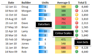
- Data Bars: Visualize data proportions with gradient bars.
- Color Scales: Compare values by assigning a color spectrum to your data.
- Icon Sets: Use icons to show trends, such as up or down arrows for growth or decline.
2. Applying Conditional Formatting:
To apply conditional formatting:
- Select the range of cells you want to format.
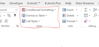
- Choose "Conditional Formatting" from the ribbon.
- Select the type of formatting you want to apply (color scales, data bars, icon sets).
- Set the conditions that trigger the formatting.
3. Real-Life Scenarios for Conditional Formatting:
- Sales Analysis: Highlight cells with the highest and lowest sales to identify top performers and areas needing attention.
- Budget Tracking: Use color scales to visualize variations from the budgeted amount, making discrepancies easily identifiable.
- Attendance Records: Apply data bars to visualize attendance rates, helping you quickly gauge trends.
Practical Tips for Using Conditional Formatting:
- Select Meaningful Colors: Choose colors that intuitively convey the meaning behind the formatting (e.g., green for positive, red for negative).
- Use Data Bars Sparingly: Data bars work well for proportional data; avoid using them for absolute values.
- Preview Rule Results: Before applying formatting, use the "Preview" feature to see how your data will look.
Homework for Excel Explorers:
Open a spreadsheet containing data you'd like to enhance using conditional formatting.
Apply color scales to visualize data trends.
Use icon sets to emphasize specific conditions in your data.
Experiment with different conditions and formatting styles.
4. Borders and Grid lines: Defining Structure and Organization:
Borders and gridlines are the unsung heroes of formatting. They provide the framework that keeps your data organized and easy to navigate. By mastering these elements, you'll enhance the readability and overall visual appeal of your Excel spreadsheets.
Adding borders to cells or ranges can provide a clear visual separation between data points. Choose from various border styles to frame your data neatly. Grid lines, on the other hand, help in aligning data and maintaining readability.
1. Borders: Framing Your Data with Finesse:
- Borders help define the boundaries of cells, making your data visually distinct and well-organized.
- Outside Borders: Frame a range of cells with a border, creating a clear separation from the surrounding data.
- Inside Borders: Use inside borders to separate individual cells within a range.
2. Gridlines: Guiding the Eye with Precision
- Gridlines are the subtle lines that appear between cells, guiding the reader's eye and creating a seamless structure:
- Showing/Hiding Gridlines: Excel automatically shows gridlines. If you wish to hide them, you can toggle this option on or off.
3. Customizing Borders and Gridlines:
You're not limited to default borders and gridlines; you can customize them to match your design preferences:
- Thicker Lines: For a more prominent border, select a thicker line style.
- Colors: Experiment with different border and gridline colors to achieve the desired contrast.
- Consistency: Maintain a consistent border style throughout your spreadsheet for a professional appearance.
- Subtle Gridlines: If your data spans multiple columns and rows, consider using lighter gridline colors to avoid visual clutter.
- Use Sparingly: Borders and gridlines are excellent for structure, but avoid excessive use to prevent overwhelming your data.
Homework for Excel Designers:
- Open a sample spreadsheet with data entries, headers, and summary rows.
- Apply different border styles to specific ranges to highlight different data sections.
- Toggle gridlines on and off to observe their impact on readability.
- Customize border colors and thickness to create a distinct appearance.
5. Custom Number Formats:Infusing Meaning and Creativity
Numbers have a language of their own. Custom number formats allow you to display numbers in various ways. Whether you want to show currency symbols, percentages, or decimals, Excel lets you tailor number formats to your liking.
Custom Number Formats are like a tailored suit for your numbers. They allow you to control how numbers are displayed, making your data more comprehensible and visually appealing. With Custom Number Formats, you'll craft an exceptional user experience for anyone interacting with your spreadsheets.
1. Creating Custom Number Formats: Your Expressive Canvas:
Custom Number Formats use a combination of symbols, text, and placeholders to define how numbers should be displayed:
Number Format Codes: These codes represent how numbers, decimals, and thousands separators appear.
Text and Symbols: Incorporate static text, such as currency symbols or units, to provide context to your numbers.
2. Mastering Common Custom Number Formats:
- Currency Format: Apply currency symbols, decimals, and thousands separators to display monetary values.
- Percentage Format: Convert decimals into percentages for a more relatable representation.
- Scientific Notation Format: Display large or small numbers using scientific notation for clarity.
- Date and Time Format: Present dates and times in various formats, ensuring consistency and readability.
3. Enhancing Data Interpretation:
Conditional Formats: Combine custom number formats with conditional formatting to create dynamic visualizations. For example, display negative numbers in red or highlight significant values.
Practical Tips for Using Custom Number Formats:
- Clear Conventions: Use consistent number formats across similar data types for uniformity.
- Textual Context: Add explanatory text within the number format to provide context for readers.
- Testing and Preview: Test your custom formats on sample data and use the "Preview" feature to fine-tune the appearance.
Homework for Excel Designers:
- Open a spreadsheet with numerical data.
- Apply a custom number format to currency values, percentages, and large numbers.
- Experiment with incorporating symbols and text into your custom formats.
-
Explore using custom number formats alongside conditional
formatting.
Practical Tips for Formatting Success:
- Consistency is key:Establish a consistent formatting scheme for headings, subheadings, and data cells to maintain a professional appearance.
- Keep it simple. Avoid overwhelming your spreadsheet with too many fonts or colors. Choose a clean and readable combination.Let white space breathe.
- Don't crowd your data; leave enough space between cells for clarity.
- Test your formatting on different devices. Make sure your formatting choices remain effective when viewed on various screens.
Homework for Excel Designers:
- Create a sample dataset with different types of data: text, numbers, and dates. Apply different font styles, sizes, and colors to your headings and data.
- Experiment with cell styles to see how they transform your spreadsheet's appearance.
- Try conditional formatting by highlighting cells based on specific conditions.
- Use borders to define ranges and add structure to your data.
- Explore custom number formats to display numbers in various ways.
As you continue on your "Master Excel in 10 Days" journey, tomorrow we'll be delving into the art of data management. Get ready to manage and manipulate your data like a pro. Until then, keep experimenting and enhancing your formatting skills!


No comments:
Post a Comment